
Hi everyone,
Today I want to share in detail the progression of the game board for Accidental Possession, and we want your opinion in the poll at the end!
In the early stages of the development of this game, our board was for a mansion over five floors, with an old map/ blueprint look - each printed on separate sheets of paper for early testing. We reduced this down to four floors to be able to get all of the plans on to one board, as well as add placeholders for the Object Cards and other decks:
Early draft of game board
Our early playtesting was carried out on the board above. In terms of the graphics, although the detail is pretty basic, it gives an 'old timey' vibe for Elixir Manor, the grey and dark blue have sufficient contrast, and the rooms that each player should start in have different colours clearly shown.
The playtesting results, however, revealed that players were unclear on how the floors linked together. The 'secret' shortcut staircases that went from the 1st to 4th floor and from the 1st to 3rd floor were confusing and the room spaces were just a bit too small.
We made a list of all the rooms that were required as noted on the Ghost Mission and Object Cards. To make minimal changes to the plans above, keeping the Main Hall area in the middle of the house with all the rooms leading off from it, the number of rooms we could include were limited and we worked out we would still need 3 floors. We decided it was worth starting from scratch and have the rooms leading off from each other as it also might make the gameplay better (e.g. when you're chasing down a player suspected of being possessed).
Being an engineer, I use Excel for everything (😅) and, naturally, I had to use it to draw up the initial plan, so I could easily play around with room sizes, and door (black rectangles below) and window locations (dark blue below). Once we were happy with the layout, I imported it into Photoshop and started adding the door symbols in the right positions on the walls between the rooms (brown below). Note: In the future I would definitely do this on Illustrator, rather than Photoshop. I will write a separate post for the main differences between the two softwares and why you should use each, and for what.
Excel imported into Photoshop
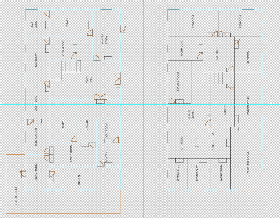
Next, I started working on the fonts and labelling all the rooms clearly and neatening up the floorplan.
Neatening up the floorplan
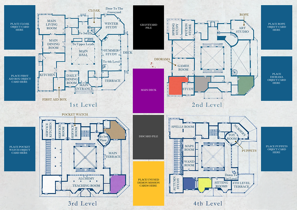
Then I resized the floorplans so I could add the placeholders for the Object Cards and other decks back on. This seemed to fit really well and I already preferred how it looked to the original floorplans, which in retrospect (and feedback from playtesters) were very busy and unclear during gameplay.
Board with card placeholders
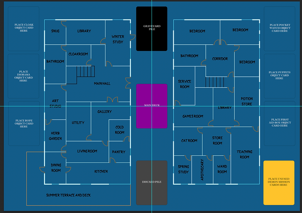
I realised that when placing cards on the (non-blue) decks, it may be unclear what each pile represents, so I added the following labels:

Board with labels for card placeholders
We had decided that the board would be quad-fold, and the cyan lines across the board represent the fold/ cut marks. There are some places where the room labels (e.g. library and art studio) are crossed by the marks, so we needed to remember to adjust these. The deck placeholders all run down the middle of the board, so there isn't much that can be done to improve that other than changing the whole layout again.


Before and after of text adjustments to avoid cut mark
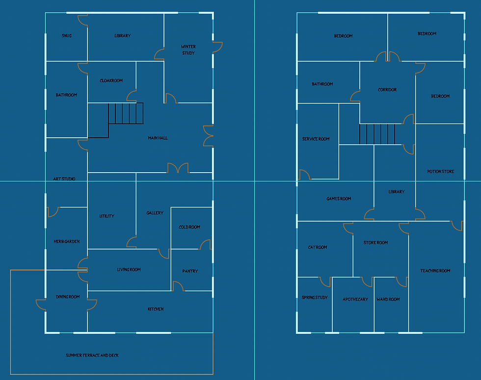
Scroll through the slideshow below to see how I started to add (a) the floor finishes to each room, (b) some labels to make it easier to spot which Object Card can be obtained from each room, and (c) the background garden area.


Floors, more labels and background
We realised that with the flooring details, we could not colour code the rooms as we had originally done for the different starting positions for players, and decided that it was best to have all the players starting at the entrance to Elixir Manor, arriving to help Arvind find this pesky ghost.
We playtested again at this point and further feedback revealed that there was not much incentive to move around the board, particularly at the start of the game, as you didn't NEED to collect the Object Cards as yet, and whilst you didn't know who the possessed player was. We decided to make a few changes to the way the Potion Cards are played.
There are 14 Potion Cards, and 6 of these require Objects. We decided that the other 8 cards should have ingredients that need to be collected for the Potions to be used. After a bit of exploring, we reduced this to 7 of the Potion Cards and created combinations of 6 ingredients that need to be collected. The only Potion not requiring any ingredients is the 'Soul' Potion Card, which allows you to draw a card from the Graveyard Pile.
We really like the way the game plays even more now and it got everyone moving around the board much more as well. So, we distributed the ingredients (Skull, Toad, Feather, Paper and Venom) around the Manor and created placeholders for spare tokens too. Finally, we added the shadow and light details to make the whole design pop!
Scroll through the slideshow below to see how it looks:


Adding the ingredient tokens, and shadow and light details
We thought we were almost done, until we held a poll on Facebook to find out what people's preferred box sizes were (asking people to choose between A5 and A4 size boxes). Until now, we had been working on A5 size booklets and to make the game box as small as possible, we thought we would make the board A3 size, which folds down to A5 size due to the quad-fold. See diagram below for what this means in both Imperial and Metric units!
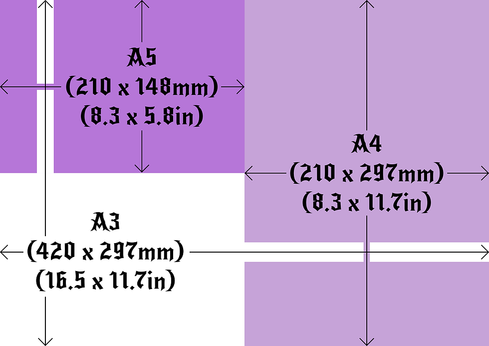
A5 vs. A4 vs. A3 paper sizes
However, we quickly realised that although these may be standard paper printing, this would definitely create a non-standard box! So, we looked up which was the smallest square box that would fit an A5 booklet, and decided to choose a 9.5" x 9.5" box. This means that we could produce an 18" square board. This has the benefit of a slightly larger board, and at the same time fits the A5 booklet without leaving a lot of empty space in the box.
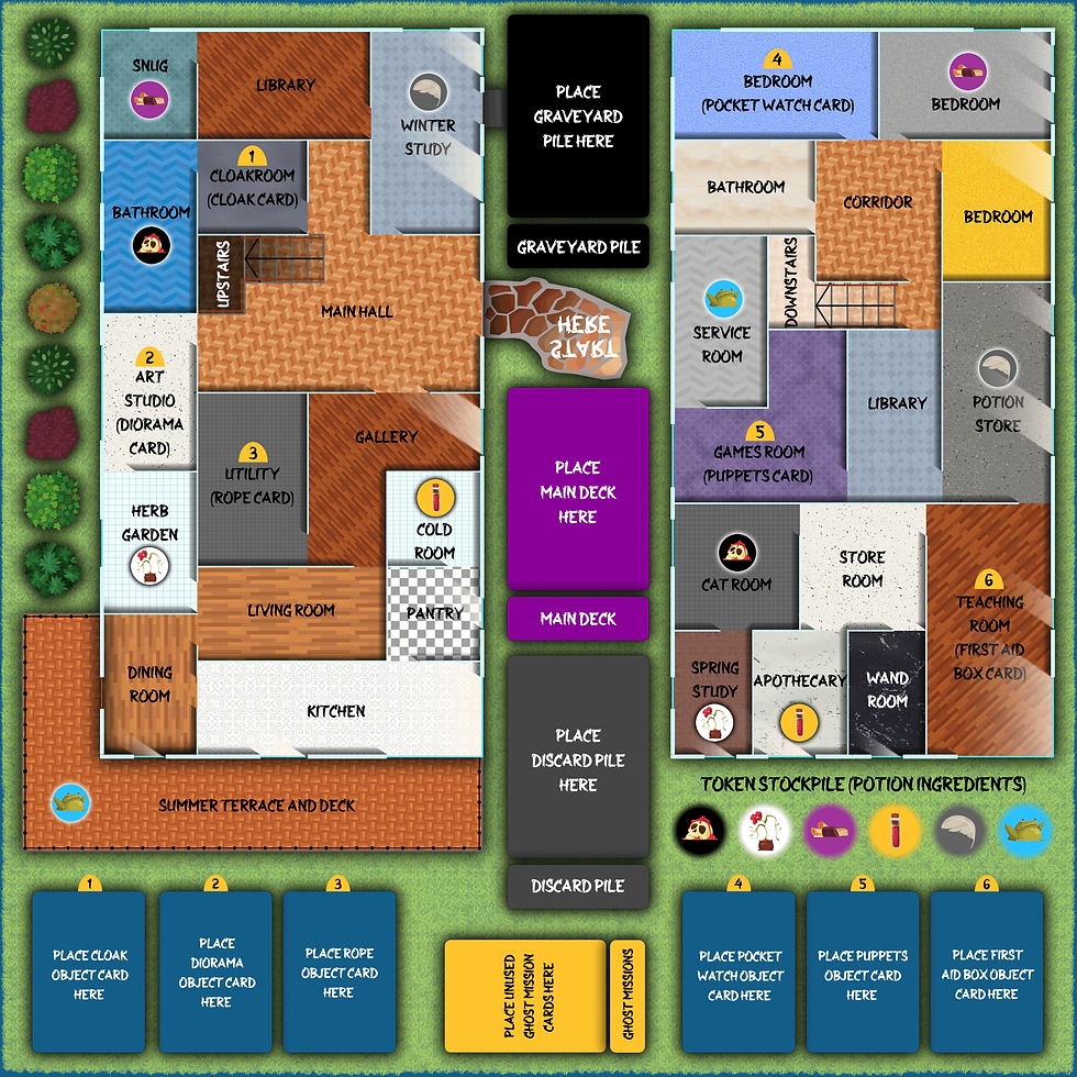
Square 18 inch board
The final potentional update is around the line width of the windows.
Windows with thicker line widths
Have a look at the external wall of the Winter Study; there are two windows and one door (to the Graveyard Pile). Do you think this is clear? Or do you think the slim lines for the windows could be confused for door openings? The picture below shows how the board looks with the lines for the windows the same thickness as the external walls. Take the poll below and let us know!
Which window design do you prefer?
Slim line windows
Thick line windows
The design may still be subject to further changes as we continue to develop the game. Let us know in the comments what you think about the game board and if there are any other improvements you'd like to see to the graphics. Also let us know if you can spot something we have intentionally left on the board...
[::]

Comments